Redesigned an updated website for K/M/A, a martial arts school in Makati and test it with participants to gather qualitative judgments.
❏ CONTEXT
While studying at CIIT (June 2022), I was tasked to create a website for a martial arts school. With this in mind, I chose K/M/A Fitness and Martial Arts as my mock client.
JUN 2022 - AUG 2022 ( 2 months )
Sole UX Researcher and Designer
Figma, Adobe Photoshop and Illustrator, Pen and Paper
Qualitative Interview Research
Qualitative and Quantitative Testing
I use */* to prevent google search from recommending my site when K/MA is searched. Disclaimer: I am not affiliated with K/MA and they are not my client in this study.
❏ INTRODUCTION
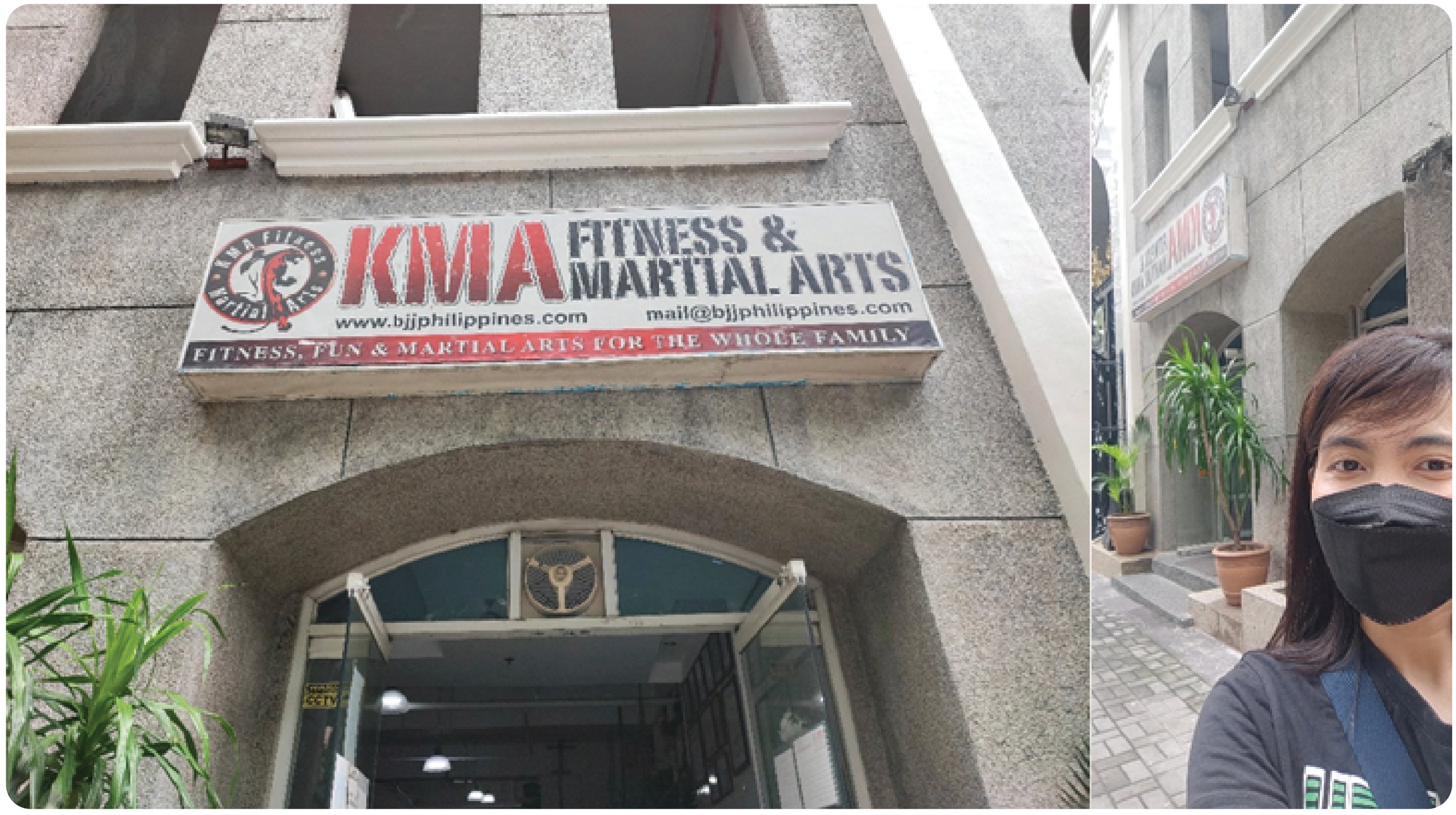
K/MA is a community center gym open for people of all ages located in Salcedo, Makati. Before I did any research, I always liked to start with business requirements, so I conducted a mini-interview onsite.
❏ PROBLEM STATEMENT
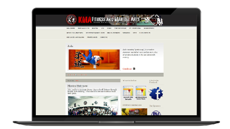
The website is outdated and bombarded with texts. This information overload can be an issue for its users ( enrollees / their parents ) when they go to inquire about or see its services and schedules.
❏ GOAL
To redesign the website highlighting call to actions, inquiry methods and limit the words people can scan
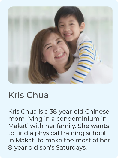
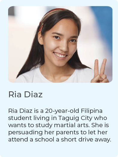
❏ QUALITATIVE PERSONA
To fully empathize with the users, here are some valuable profiles of the visitors.
*Empathy maps and user journey maps will be presented during the design interview
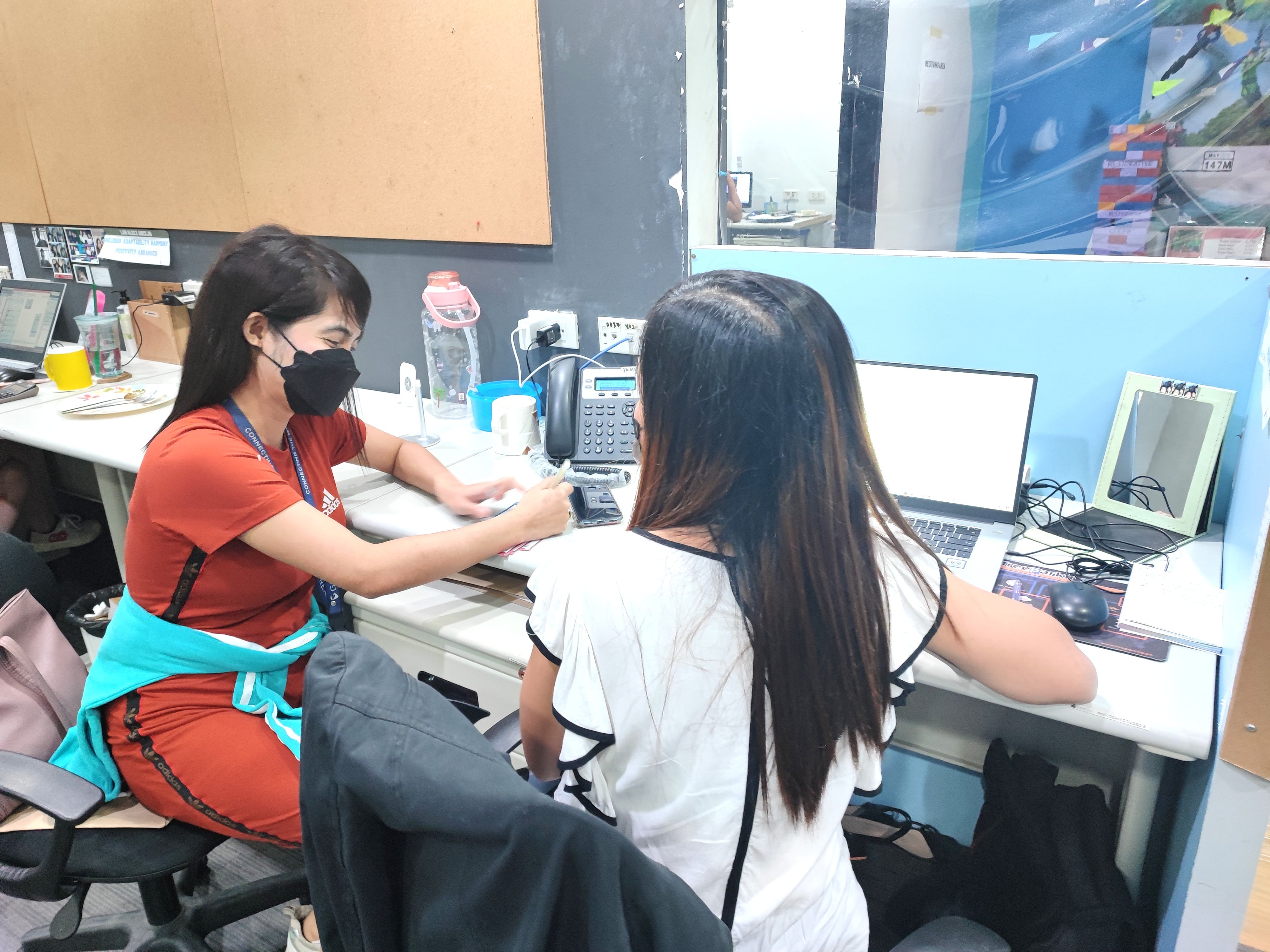
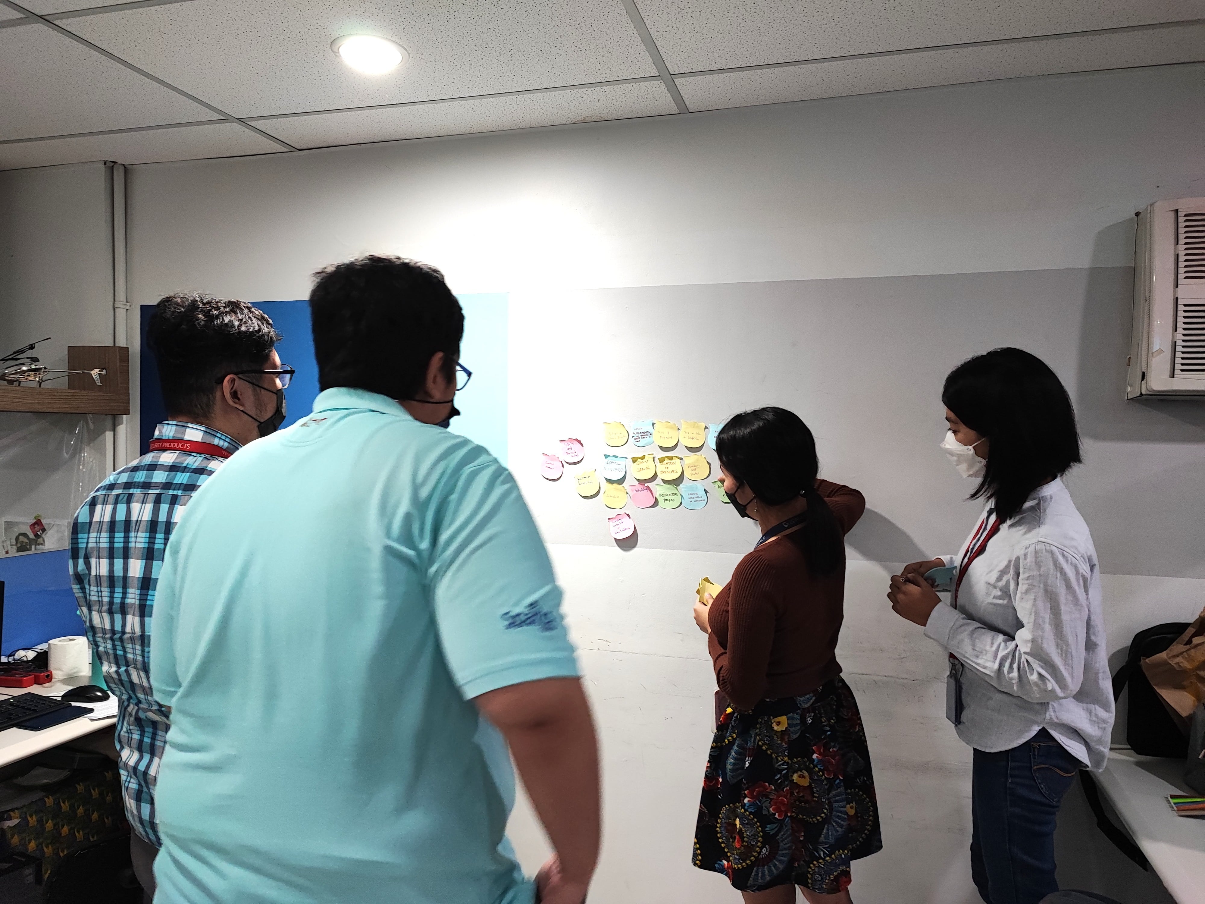
❏ INTERVIEWS
With the goal of starting a redesign, I asked the people on my current company's technical team to assist me in brainstorming technical functionalities. I also interviewed Filipina and Chinese moms in other departments and asked them what they were looking for. I also personally interviewed two Filipina moms outside work.
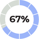
12 participants and their
TOP 3 Priorities
when enrolling in a martial arts school
6 moms
Safe Handling
Safe Vicinity
Benefits of Enrolling
6 tech people
Price and Payment
Company Information
Language Option
❏ INSIGHT
"AHA! I wanted to design a website that feels SAFE!"
I conclude that we can classify mothers and single people. Mothers prioritize the overall safety aspect. From my interviews, this was what I wanted to be the dominant feeling among the users when they visit the website.
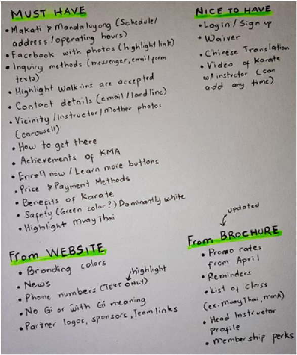
❏ WEBSITE CONTENT
I jotted down must-haves and nice-to-haves for the company website from interviews and the existing website.
I obtained takeaways from other websites for competitive and inspirational analysis.
For competitive analysis by vicinity: Physical training school in Makati http://www.makatiaikidoclub.com/
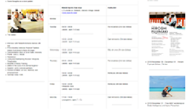
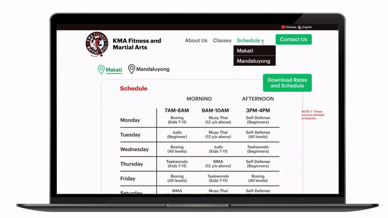
Take: I wanted KMA Schedule System to be straightforward and orderly too.
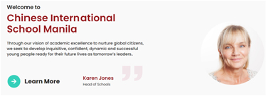
For inspirational analysis: Familiar Chinese school http://www.cismanila.org
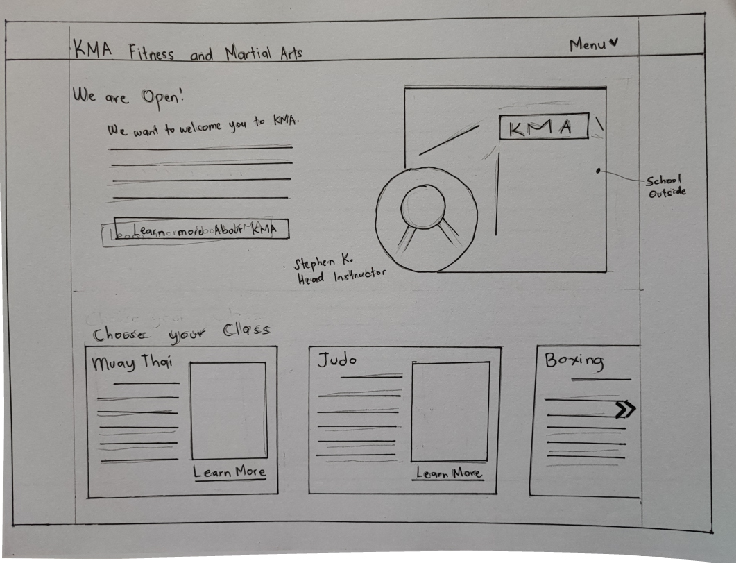
Take: I wanted to introduce the head instructor as if she is welcoming the parents and students.
Other websites for inspirations: www.ballet.ph: Body coordination and focus www.nike.com.ph: Be moving
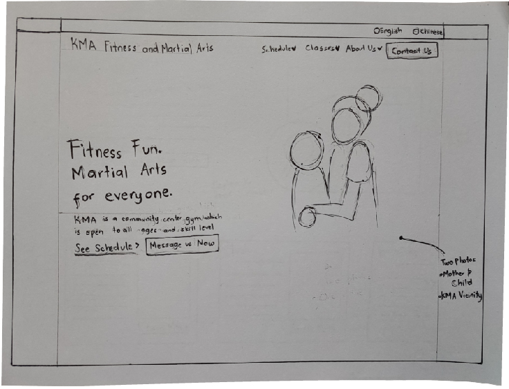
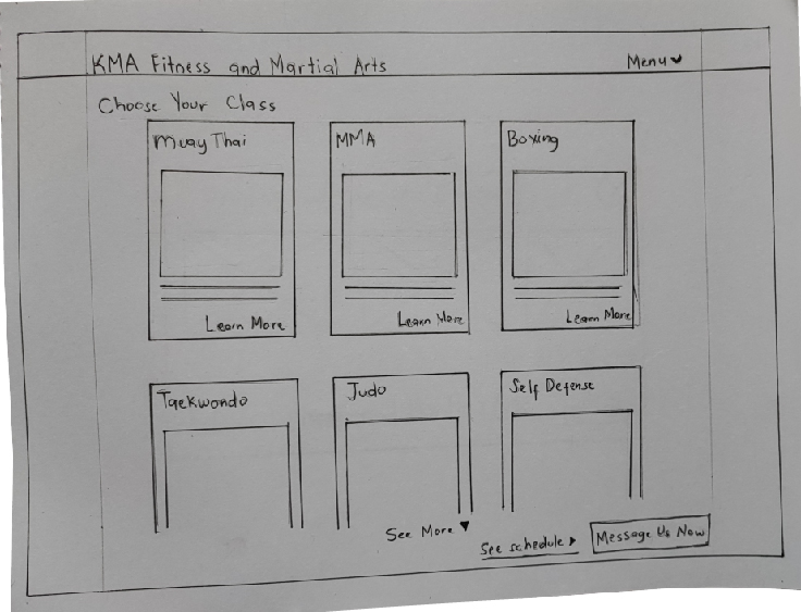
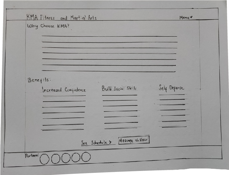
❏ LOW-FIDELITY DESIGN
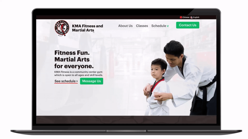
My initial thought was to change the branding color to green to emphasize safety. But to maintain the branding colors of the website, which are dark red and black, I should make white the dominant color.
To emphasize feeling safe, I wanted the hero photo to be a mom hugging her son wearing a martial arts uniform. Unluckily, I cannot find that certain photo. If they are my client we’ll hire a photographer, but for now, I used photo of an instructor carefully helping his student.
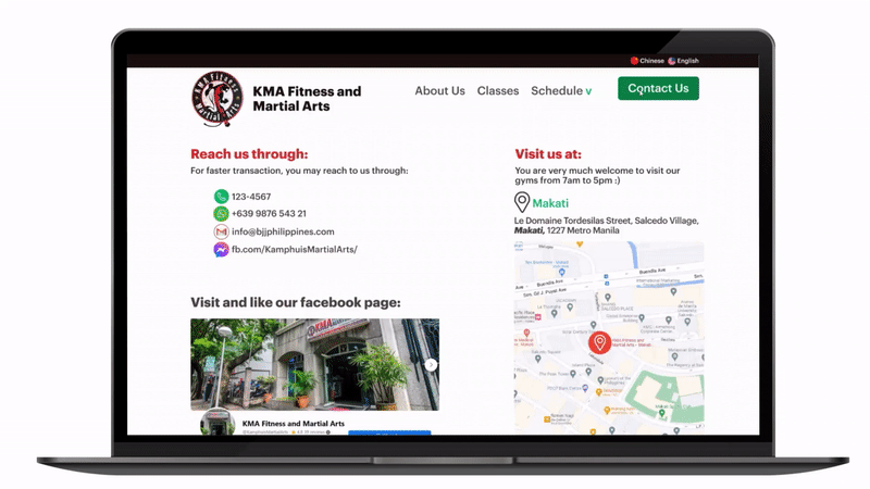
❏ HIGH-FIDELITY DESIGN
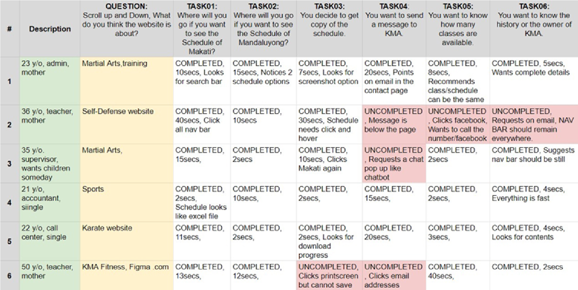
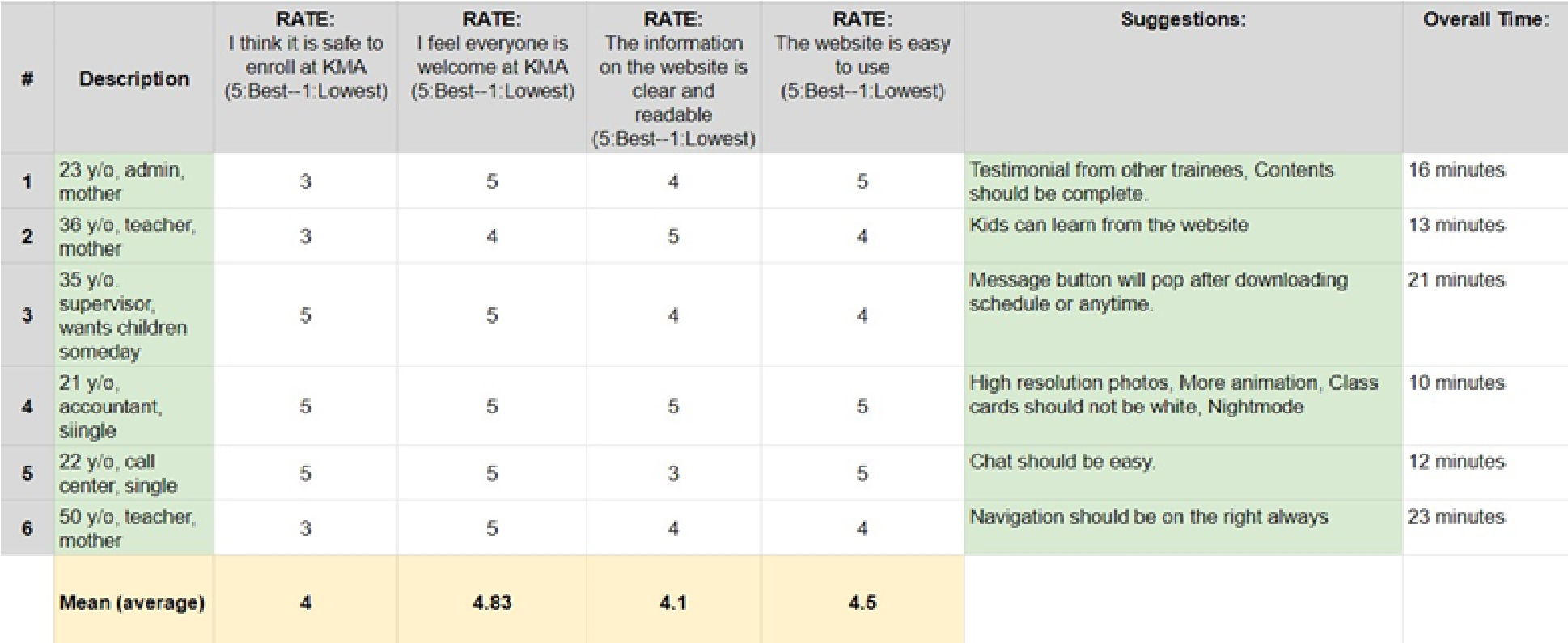
❏ TESTING
I tested the design with three moms and three single people in their 20s.
❏ RECOMMENDATIONS
From testing, here are the recommendations for the next design iteration:
The navigation should be fixed all over the website.
Complete the details on the about page and classes.
The Printscreen keyboard can download the schedule or create a button saying "Get Schedule".
Chatbots or direct messages to the school's phone number or Facebook shall be designed on the landing page. (A pop-up will appear while scrolling.)
The Schedule Navigation button, not just the drop-down, should be clickable.
Individual classes tab should be clickable.
❏ PERSONAL TAKEAWAYS
Here are what I have learned from this case study:
I thought I needed 20 participants, but 5 participants are enough to get good feedback for qualitative research.
A token of appreciation for the interviews should be given after the interviews, not before.
Giving them food after the interview could really be a good token.
People become annoyed and curious when their personal information is collected. Explain thoroughly that their data is anonymous and will not be shared with anyone.